
Compression is often mistaken for making something smaller.
But smaller is only the result. In any model, the real work is deciding what must survive the reduction.
Imagine you are late for a meeting on the other side of London. You open the Tube map.
The map does something strange. It straightens lines that curve. It stretches some distances and crushes others. It removes nearly every road, building, hill and landmark in the city.
Yet within seconds, it tells you what you need to know: where you are, where to change, and which stop comes next.
The map works because it is unfaithful in the right way. It loses the physical shape of London in order to preserve the structure of the journey.
That is compression: structured loss in service of a next move.
The five-part bargain
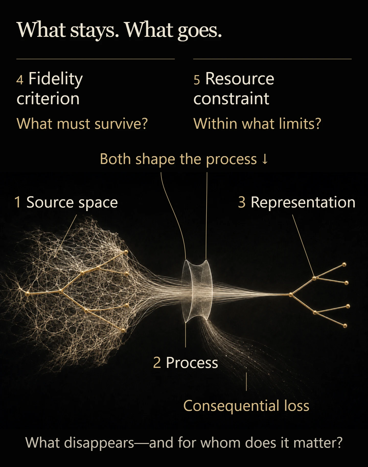
Every useful compression makes the same five-part bargain. The Tube map simply makes the bargain easy to see.
The source space is the thing too large or detailed to hold at once: London, its streets, its distances, and its underground network.
The process is what performs the reduction: the decisions that straighten, separate, label and simplify.
The representation is what remains: the diagram in your hand.
The fidelity criterion is the test of what must be preserved: can a passenger work out how to travel from one station to another?
The resource constraint is the limit the representation must live within: a small screen, a crowded carriage, and a few seconds of attention.
These are not five academic labels added after the fact. They are the hidden structure of anything made small enough to use.
When the five parts line up, throwing information away creates usefulness. When they do not, the same act of omission creates confusion, distortion, or harm.
Change the question and the map changes
The Tube map is excellent for choosing a train. It may be poor for deciding whether to walk. Two stations that appear far apart can be close together above ground. A version without step-free information may be useless to someone who cannot take the stairs.
The representation has not suddenly become true or false. The task has changed, so the important losses have changed with it.
This is why “Is the map accurate?” is an incomplete question.
Accurate for what?
A compression can be faithful to one purpose and careless toward another. The criterion is the hinge between the two.
When a whole institution becomes one number
Now imagine choosing a school and being shown two scores: 92 and 86.
Each number compresses an enormous source space: lessons, friendships, discipline, confidence, exam results, teacher judgment, additional-needs support, safety, and thousands of daily interactions no inspection could fully observe.
A process selects some of that material. A score becomes the representation. A criterion decides what counts. A website and a parent's limited attention impose the constraint.
The number may be useful. If its criterion is clearly defined, it might answer a narrow question quickly.
The trouble begins when the criterion disappears and the score starts travelling under a larger name. “Higher against this particular test” quietly becomes “better school.” A compact answer to one question begins pretending to answer every question.
For one child, the missing detail may not matter. For another, the omitted fact—whether specialist support is available, whether they feel safe, whether a teacher notices when they disappear into the back row—may be the fact that matters most.
The same omission can matter very differently to different children.

This is where compression becomes political. Choosing what survives reduction helps decide which parts of reality are allowed to affect the decision.
The argument is often hiding in the test
We tend to argue about the representation: the score, the headline, the risk rating, the league table, the summary produced by an AI.
But the deeper disagreement often sits one layer earlier.
What was the compression built to preserve?
A hospital target might preserve speed. A school ranking might preserve exam performance. A platform metric might preserve attention. Each can produce a clean, comparable number. None is entitled to call that number the whole purpose of the institution.
Once a compressed measure starts guiding rewards and decisions, people adapt to it. The representation no longer merely describes the source world. It begins to reshape it.
That does not make metrics corrupt or simplification dishonest. Finite systems cannot act without compressing. It means the test deserves at least as much scrutiny as the result.
Six questions that expose the bargain
Any model, score, dashboard, slogan, category, or summary can be opened with six questions.
What larger world went in?
What process reduced it?
What smaller representation came out?
What test decided which distinctions mattered?
What limit forced the compression?
What disappeared—and for whom does that disappearance matter?
Ask these in order and a polished number becomes inspectable. You can see not only what it says, but the bargain that made it possible.
The answer is not to keep everything
A Tube map containing every street, gradient, building and change of paving would cease to work as a Tube map. A school report containing every lesson, conversation and passing mood would be impossible to read and intrusive to create.
The answer to consequential loss is not always more information.
Sometimes the representation needs one missing distinction. Sometimes it needs a second view for a different purpose. Sometimes the claim around it simply needs to shrink: not “the best school,” but “the highest score on this test.” And sometimes the people made invisible by the model need a way to answer back.
A good compression does not pretend to be complete. It makes its incompleteness useful, visible, and correctable.
That is why compression is structured loss. The important question is not whether information disappeared. It had to. The important question is who decided what had to survive, which action that choice now guides, and whether the bargain can still be challenged.
A question to carry with you
Choose one dashboard, category, or model. What consequential loss does it hide?
From The Compression Point by Felix Pope.